
What is Liferay Adaptive Media?
Liferay Adaptive Media is a powerful feature within the Liferay Digital Experience Platform (DXP) that automatically optimizes images and media content for faster delivery across different devices. This tool intelligently resizes, compresses, and serves images based on the device's screen size, resolution, and bandwidth, ensuring users experience faster load times without compromising the quality of media.
How Liferay Adaptive Media Improves Website Speed?
Liferay Adaptive Media helps websites deliver optimized media content, resulting in faster load times. Here's how:
- Automatic Image Resizing: Adaptive Media automatically adjusts image sizes based on the user's device, reducing unnecessary data usage without affecting visual quality.
- Image Compression: The feature intelligently compresses images to balance quality and size, ensuring they load quickly without sacrificing detail.
- Lazy Loading: Adaptive Media uses lazy loading to delay the loading of images and media files until they're needed. This means users only download media that is visible on their screens, reducing initial load times.
Liferay Adaptive Media is a game-changer for businesses looking to optimize their websites for speed and mobile performance. By automatically optimizing images, videos, and other media content, it ensures that your site loads faster, performs better, and provides a seamless user experience on all devices.
- Faster Load Times: Optimizes media for faster delivery without sacrificing quality.
- Mobile Optimization: Automatically adapts images and media for mobile devices, enhancing the user experience.
- SEO Benefits: A faster website can lead to improved SEO rankings and enhanced search engine visibility.
How to Use Liferay Adaptive Media?
Implementing Liferay Adaptive Media in your Liferay DXP environment is a relatively straightforward process. It involves configuring the platform to automatically optimize media based on the device, size, and bandwidth. Here's how to get started:
Define the image variant you want to use
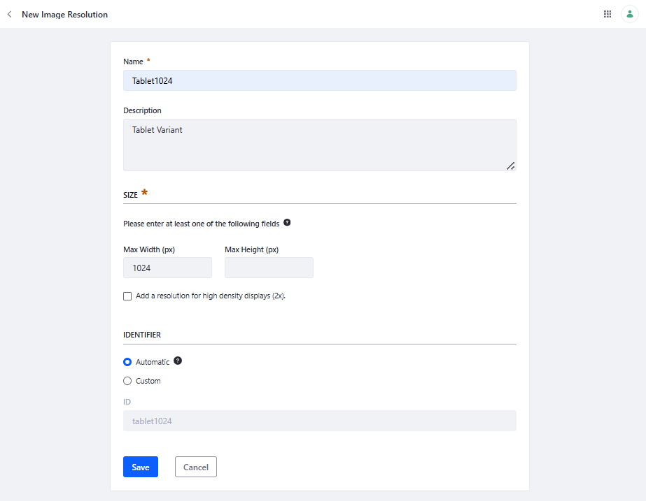
- Go to the Control Panel, and click Adaptive Media.
- Add a unique name and description.
- Define Max Width and/or Max Height in pixels.
- Enable/disable adding a resolution for high pixel density displays. This resolution uses the same name as the current resolution and adds the -2x suffix to it.
- Keep the identifier Automatic if you are not using third-party APIs for changing image resolutions.
i.e, we can add different variants according to our screen size. Let's say we can define Max Width 300px-768px for mobiles, 768px to 1024px for tablet, and after that for desktops as well. We can add as many variants as we want to use.
Now click on actions for that variant and click on Adapt Remaining or if we don't want to do this one by one, we can select the action button on Adaptive media and can use Adapt All Images.
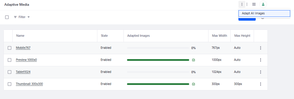
This may take some time because Liferay is adding variants for all the images available in your system. As this process is finished we can move on further.
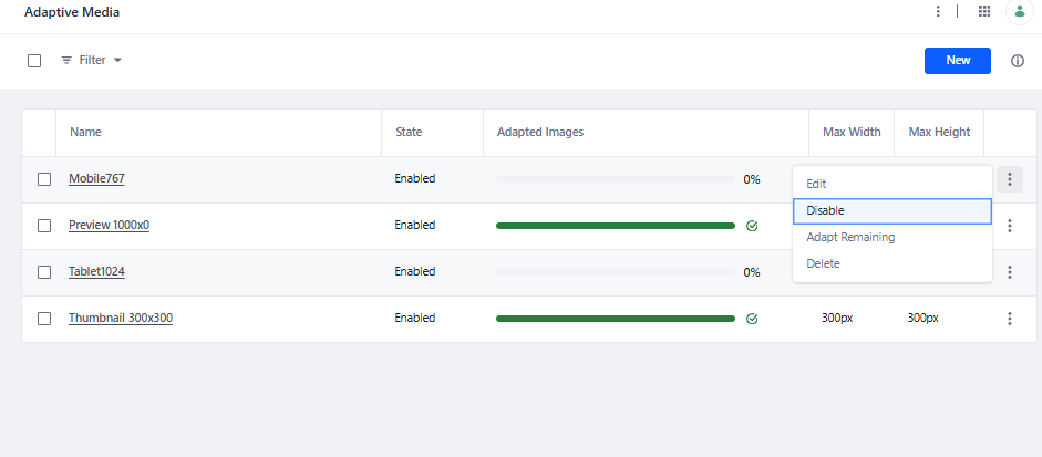
If you have defined multiple variants and want to use only few of them according to your need ? You can disable or enable them anytime from actions.
Use this variant in ADT / Web Content Templates
Let's say we have a web-content which have an image field named as HeroBanner. To use adaptive images for HeroBanner, we can write the code as:
<#if HeroBanner.getData()?? && HeroBanner.getData() !="">
   <img data-fileentryid="${HeroBanner.getAttribute("fileEntryId")}" alt="${HeroBanner.getAttribute("alt")}" src="${HeroBanner.getData()}" />
</#if>
Now you are all set. You can see the changes in your HeroBanner images.
You can see the <picture> tag on page render. (Liferay default)
<picture data-fileentryid="000001">
    <source media="(max-width:300px)" srcset="/o/adaptive-media/image/000001/Thumbnail-300x300/My_HeroBannerimage.jpg?t=time_stamp">
    <source media="(max-width:768px) and (min-width:300px)" srcset="/o/adaptive-media/image/000001/mobile768/My_HeroBannerimage.jpg?t=time_stamp">
    <source media="(max-width:1024px) and (min-width:768px)" srcset="/o/adaptive-media/image/000001/tablet1024/My_HeroBannerimage.jpg?t=time_stamp">
    <img class="img-responsive" alt="" data-fileentryid="000001" src="/documents/730743/730820/My_HeroBannerimage.jpg/file_uuid?t=time_stamp">
</picture>
Here we have disable the default variant Preview-1000x0. Here we can see the generated <picture> tag according to screen size.
Notes:
- You cannot edit a resolution's size and identifier if Adaptive Media has used it to generate adapted images.
- Be careful when deleting image resolutions. Once deleted, the resolution's adapted images are irretrievably lost and are not replaced automatically by new image resolutions you create.
- Adaptive Media doesn't work with images added from the URL tab in the file selector for both blog entries and media content articles.
- Adaptive Media, which is included by default starting with DXP 7.1+. If you're upgrading from an older version that didn't support Adaptive Media and want to manage your thumbnails using this feature, reference.
Challanges
Case 1: This solution is highly effective for scenarios involving full-width images, such as full-screen banners or carousels, where the image spans the entire viewport. Shown in below image.

Case 2: In this case, we typically do not utilize full-screen images. Instead, layouts often feature images that occupy half or less of the screen width, typically alongside textual content. Shown in case-2 in below image.

In such cases, Liferay Adaptive Media does not automatically adjust the image resolution based on the actual rendered size within the layout. As a result, images may be served at higher resolutions than necessary, impacting performance.
To address this, a custom implementation is required to ensure image variants are dynamically selected based on the rendered dimensions in the layout.
To take advantage of Liferay's adaptive image we can use <picture> directly in our templates.
Now let's say we want to use ProfilePic image for a Case-2. We should write <picture> tag like,
<picture>
    <source media="(max-width:300px)" srcset="/o/adaptive-media/image/000002/Thumbnail-300x300/My_ProfilePicimage.jpg">
    <source media="(max-width:768px) and (min-width:300px)" srcset="/o/adaptive-media/image/000002/Thumbnail-300x300/My_ProfilePicimage.jpg">
    <source media="(max-width:1024px) and (min-width:768px)" srcset="/o/adaptive-media/image/000002/mobile768/My_ProfilePicimage.jpg">
    <img class="img-responsive" alt="" src="/documents/730743/730820/My_ProfilePicimage.jpg">
</picture>
In this implementation, we utilize the thumbnail variant (300px) for screen widths of 300px and 768px, and the mobile variant (768px) for screens up to 1024px. This is based on the assumption that the image occupies approximately half of the screen width. The mobile variant can also be extended for use on screens up to 1440px by adding an additional <source> tag.
The selection of the Preview and Mobile image variants depends largely on the size of the container in which the image resides. For this example, we assume the image is placed within a col-6 class, which typically spans about 50% of the screen, with additional padding applied through the image class.
While this approach does not offer pixel-perfect image resizing for every screen width, it provides an optimal balance between performance and image quality. As a result, it significantly enhances page load speed and overall site performance, particularly on mobile and responsive layouts.


